the montclarion
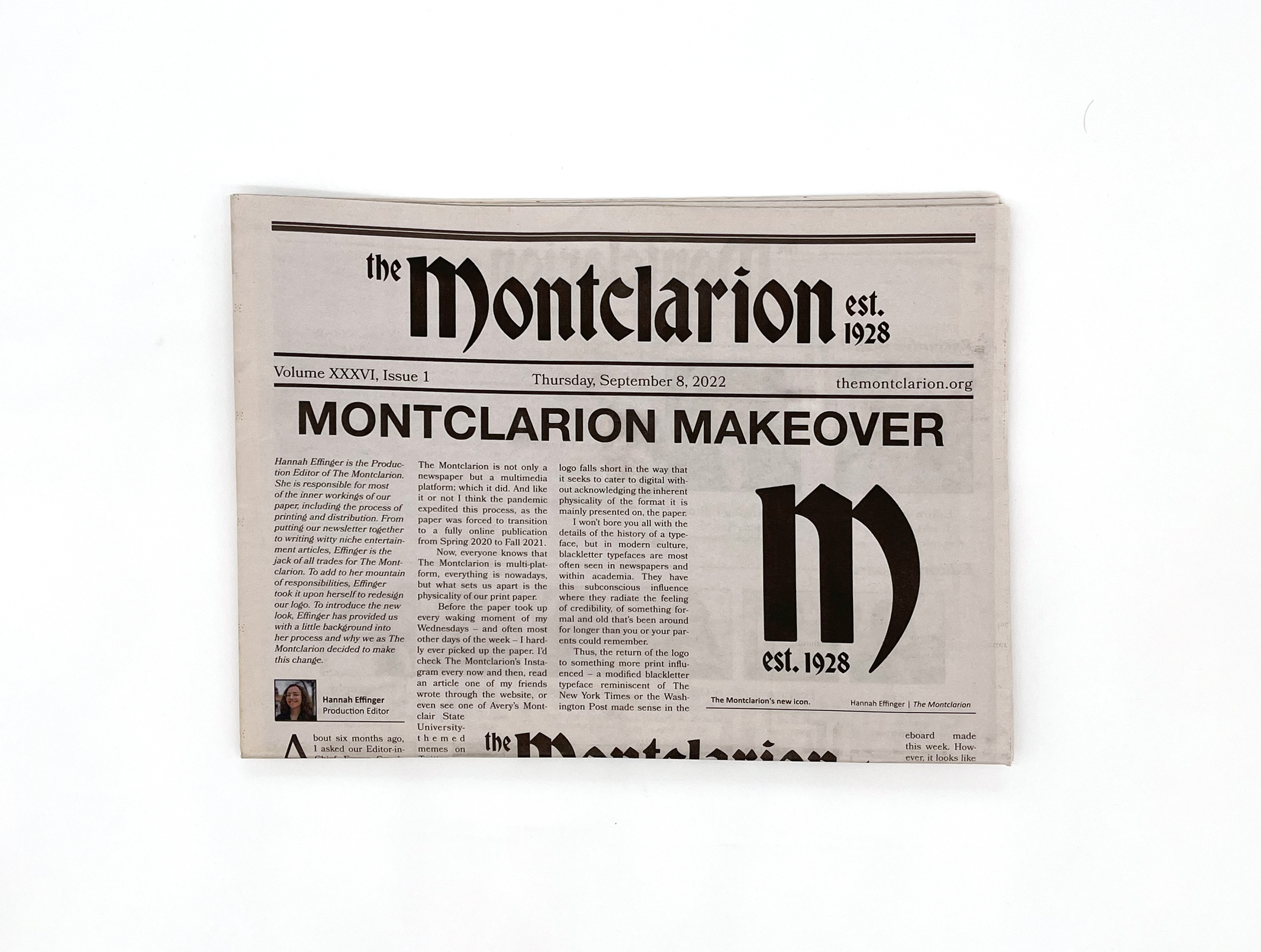
editorial / apparel designAs the Creative Director of the Montclarion, Montclair
State University’s student-run newspaper, I was able to
redesign their logo, layout, and merchandise, completing
a complete overhaul of their existing branding.
In this redesign, my goal was to emphasize the history of print and its importance to the organization. Since The Montclarion had been pushing a “digital-first” approach to reporting following the COVID-19 pandemic, this return to a more classic, blackletter style wordmark was meant to remind readers of the inherent physicality of the paper format. Additionally, I used this style to feed into the subconscious influence that blackletter typefaces emulate, where they radiate the feeling of credibility, of something formal and old that’s been around for longer than you or your parents could remember.
Check out my full article about the redesign here.
Layout and Cover
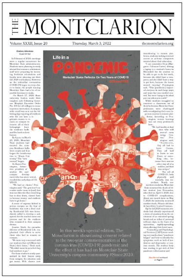
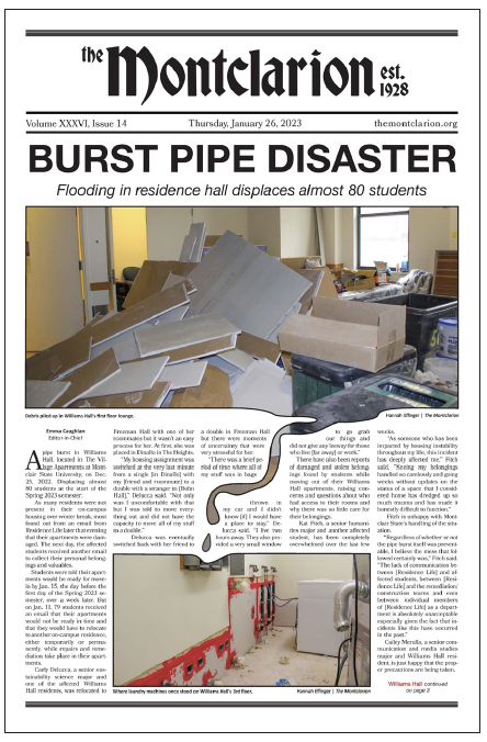
Each week I was responsible for designing an eye-catching front page in order to get passerby to pick up the print paper.
This became a kind of weekly experiment to see how expressive I could get with each new edition ‑ my favorites are shown below.


Layout Guidelines
Within the print paper, I instituted guidelines for each section in order to keep the layout consistent throughout each issue.
These guidelines are concerned with typeface usage and alignment of body text, as the overall brand is conveyed in the section headers and front/back page headers, and do not change from week to week.
Merchandise
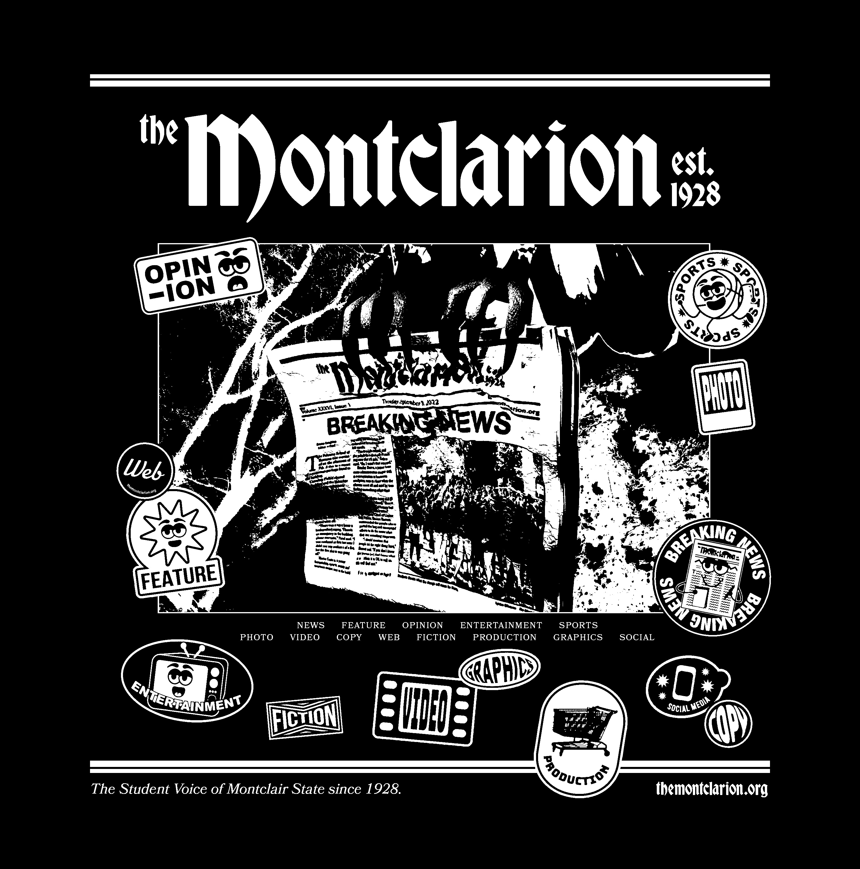
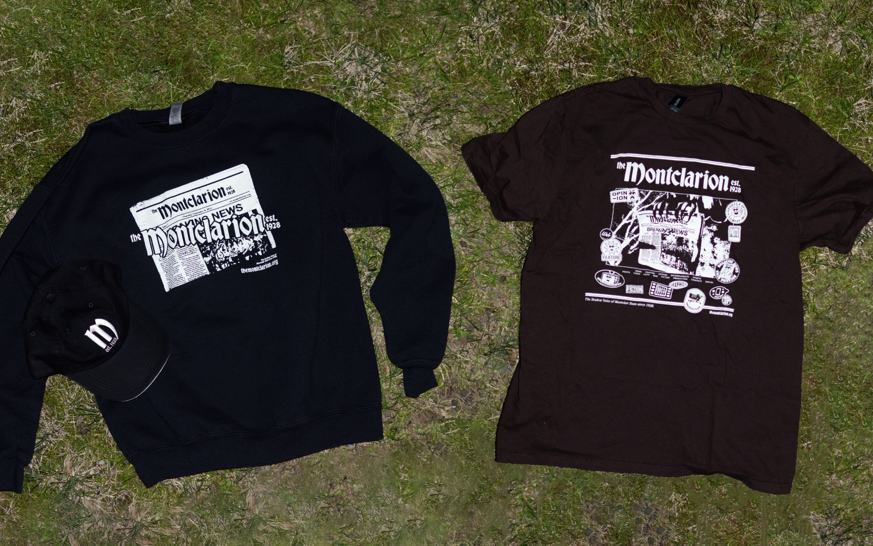
In the photo below, the design to the left is meant to be a simple reminder of the Montclarion’s print paper, as it features a photo of the paper with its logo superimposed on top.
The design to the right features a more unique approach to presenting who The Montclarion is as an organization. Its design features the top and bottom bars found on every page of the print paper, along with a photo of Montclair State’s mascot, the red hawk, holding a copy between its talons. Each section/team within the staff also receives its own sticker within the design with most of the sticker designs having input or inspiration from the individuals behind them.

24–09–2024