Design
3. Revision 1
October 20, 2022
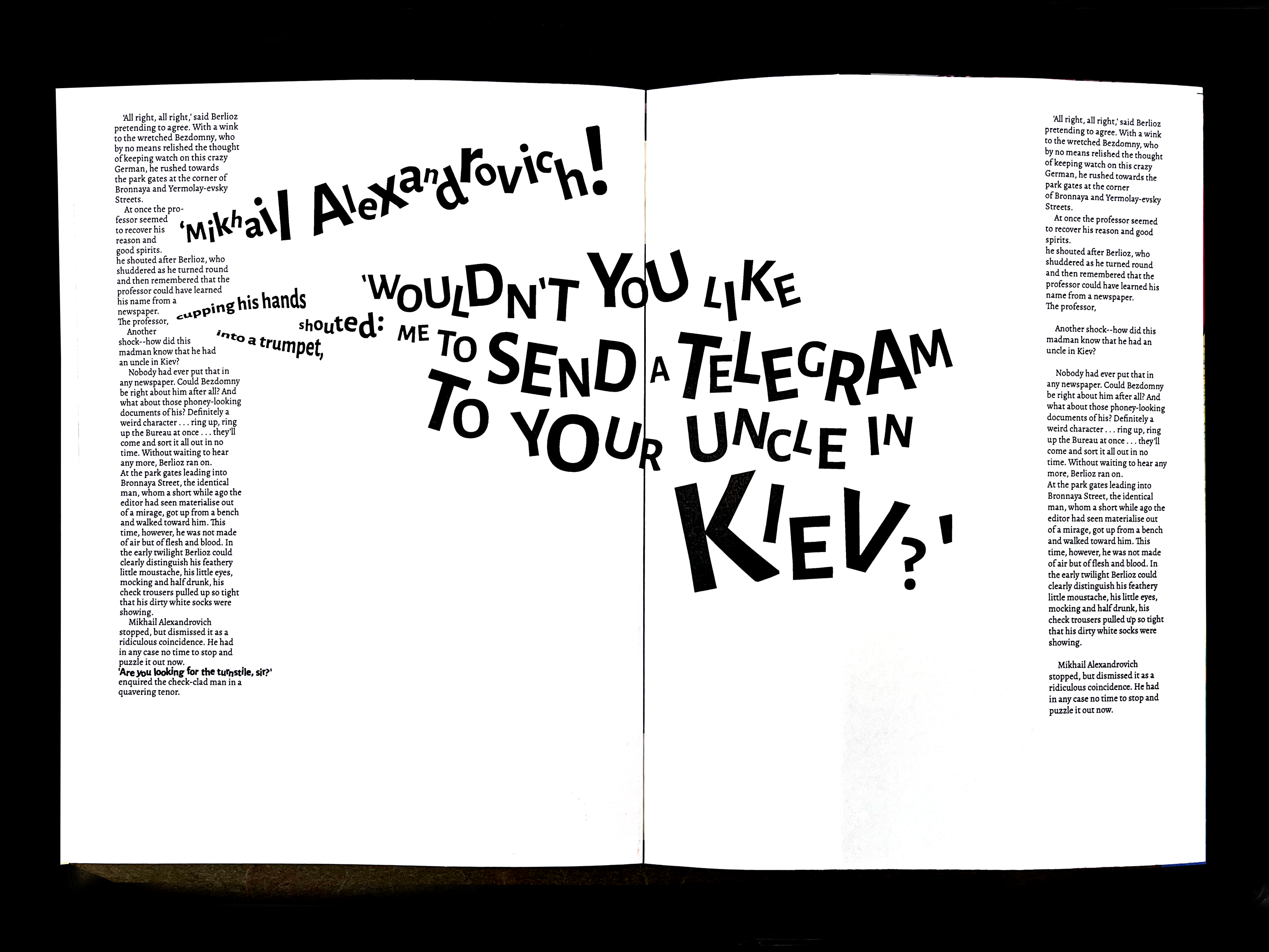
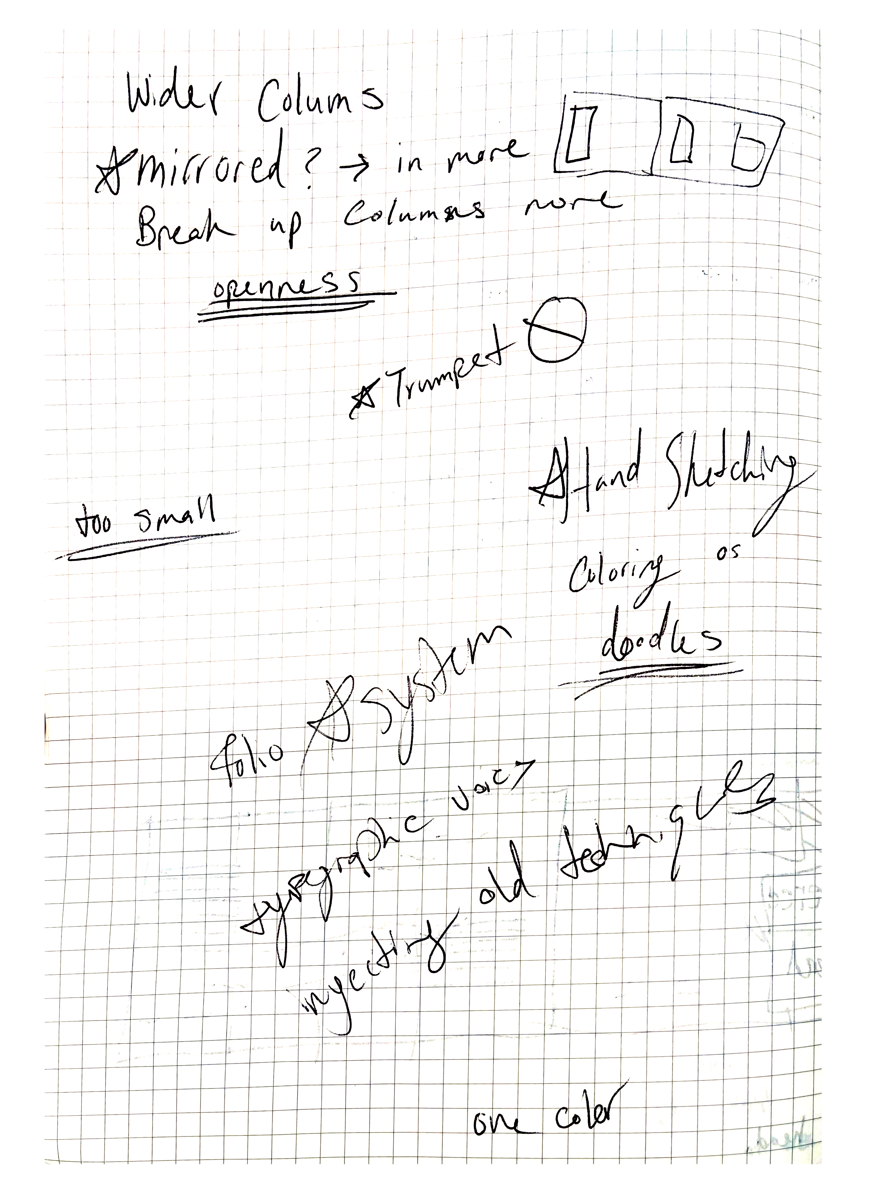
This week I worked on creating spreads in InDesign and printing them out to see how they look in the physical realm, rather than purely digital. My notes from the critique are below, but after getting a critique of my printed spreads - I found that the text was way too small, and that the sans-serif text did not operate in the story the way that I hoped it would. I felt as if were too child-like in comparison to the book. I felt the movement within the type was good, and worked in a way - but did not operate in the way that I intended it to.
The one critique that really intrigued me was to take my work and physically annotate it with a red marker, to show the intrusion of the devil in the story in another way.

