Ideation
3. Further Findings
December 8th, 2022
Through working on this project I found that I really dove into a postmodernist design approach, as I chose to emphasize my own interpretation of the book within my design. I opted to neglect the traditional format for books, looking to make the design of the type more visually interesting, and therefore more fun for the reader to view even when they are not reading the text.
Here, I took some inspiration from the contemporary designers Paula Scher and Barbara Kruger. Both of these designers use their type in expressive ways - Scher uses large letters with varied sizes and rotations to create hierarchy, while Kruger uses bold, more sober type to emphasize a singular point in her works.
Postmodern Design: At its core, postmodernism was an attempt to break free from the practical, muted, and often impersonal approach of modern design. Instead, postmodernism celebrates the unconventional, the flashy, and the weird.
Fueled by the idea that design doesn’t need to follow rules, the postmodern style mirrored the emerging social outlooks of the times. Mismatched elements came together to create playfully extravagant looks, and the definitions of an item’s function became more fluid.
via: NewHomeSource.com


Concrete Poems: Verse that emphasizes nonlinguistic elements in its meaning, such as a typeface that creates a visual image of the topic.
via: PoetryFoundation.org
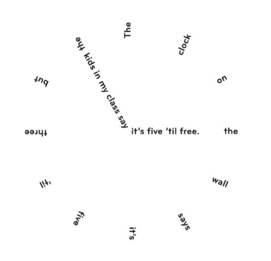
I also became really inspired by concrete poems. For the less dialogue-heavy parts of the story, especially the end, I wanted to make the text feel more poetic, so I used dainty little type patterns like these to create a more interesting composition in the more picturesque parts of the book.

